Showing posts with label self-published comics. Show all posts

Monday, September 30, 2013

Learning to Walk with Jusay Pulp

Jusay Pulp is a newish self-published anthology from cartoonist Jeremy Jusay. Jusay has self-published a small handful of comics over the past few years but this is my first exposure to his work. The debut issue has a lot going for it - mostly the nice production values and killer price.  At twenty oversized black and white pages with a glossy cover for just three bucks, many mini-comic makers and self-publishers should learn from Jusay's example of how to reasonably price an independent comic.

Jusay Pulp 1 features a self-contained short story ("Ghosts of New Wave") about a depressed NYC art student who conjures imaginary friends that are zombie versions of various New Wave bands who help her through life. The narrative is a cute enough diversion, if perhaps a little too precious. I liked the art style, a bold Jaime Hernandez line with nice detail in cityscapes. But, and its a big but, it's one thing to have nice figures and to nail the architectural detail  of life in this City, it's another thing entirely to tell a story with your art, and Jusay's stuff stumbles hard on the mechanics of comic storytelling, and especially, most definitely in body movement.

Three locomotive sequences from the comic.
The framing of too many scenes falls flat with unnecessary closeups that are engulfed in word balloons (Jusay should really check out Wally Wood's 22 Panels That Always Work). He needs to set the scene with a little more clarity and most importantly, pull back. The biggest problem, and it's a whopper that makes the comic very difficult to read, is the stiffness of the basic action. Jusay, at lest here, doesn't seem to be able to draw anyone in movement. Every single panel of people walking in this comic is a breathtaking example of how not to draw someone walking. Characters appear to be rigidly marching, every single form an inflexible pose of someone pretending to walk, or doing the Captain Morgan pose, more reminiscent of an alien from another world trying to mimic human movement. An action scene where someone swings a guitar looks like someone simply holding out a guitar. Even a fanciful sequence of characters in flight has an odd rigidity too it.

Jusay kills it with his wonderful, clean line, his details like subway cars and City streets (likely photoref'd but that's fine), the gorgeous fashion, the faces... But the flow of the story is interrupted by rough staging and really, really bad kinesiology. As first issues go, as self-published comics go, I've seen much worse, and it's a damn good value at three bucks. But the problems with the art are unavoidable and cannot be overcome by the strength of the fairly twee story. But these problems are something that can be fixed, and hopefully he can tweak his movement in future outings.

--
Jusay Pulp 1 is in finer comic shops now, and available from the author's website.

Monday, August 26, 2013

Visions of Epilepsy from David B and Sam Humphries

Looking at two radically different responses to a life marked by epilepsy, Sacrifice by Sam Humphries & Dalton Rose and Epileptic by David B.

Epileptic by David B
L'Association/Pantheon, 2005
Epilepsy, a blanket term for a range of varied but related neurological syndromes, often involve seizures that can range from minor to completely incapacitating, sometimes accompanied by hallucinations, often having adverse emotional effects on the sufferers and those around them. Two completely different graphic novels deal with this in their own ways: David B.'s ground-breaking memoir Epileptic deals with the effect his brother's condition has had on his family, and writer Sam Humphries' Sacrifice, a fictional take of one epileptic's journey from a writer who suffers from the condition himself.

Epileptic by David B. (the pen-name of L'Association co-founder Pierre-Francois Beauchard) was serialized in France between 1996 and 2004 as L'Ascension du Haut-Mal (The Rise of the High Evil) and released as one extraordinary volume by Pantheon in the United States in 2005. A memoir of Beauchard's upbringing and his brother Jean-Christophe's debilitating epilepsy and the profound effect that had on Beauchard's life and that of his family, Epileptic sits at the vanguard of the modern graphic memoir movement.

The memoir opens up with Beauchard visiting his family as an adult, and encountering his brother, a physical mess, his face and body racked with scars, out of shape and all but unrecognizable to Beauchard. Things then process chronologically from early childhood, beginning in Beauchard's idyllic youth in Orleans, France. But the innocence of childhood is shaken up by his brothers frequent seizures, and Jean-Christophe is diagnosed as epileptic. Sometimes his crippling seizures, which can last seconds or hours, are triggered by stress or high emotion, and sometimes they just happen randomly. Jean-Christophe's condition casts a pall over the entire family as they come to terms with their capricious, random effects and the lack of understanding from friends, neighbors, and authorities.

The time frame of the events in the book begins in 1964, and the public and medical understanding of epilepsy was scant and even contradictory, at best. Differing diagnoses and treatment schemes all fail to work on Jean Christophe's condition for very long, and soon the family finds itself repeatedly trying the services of obvious quack physicians, far-fetched dietary restrictions, and full-on cults replete with hippie communes and restrictive living practices. Jean-Christophe's condition is all but untreatable, and soon the darkness of his condition draws him down a path of depression and anger. Jean-Christophe withdraws into himself, lashing out at his family and pursuing dark obsessions, shutting himself off from the world. The entire family suffers through Jean-Christophe's disease and increasingly useless treatments, and soon have to suffer Jean-Christophe himself, a shell of a person given over to a darkness that spreads out all around him.

There is a repetitiveness to the family's cycles of quacks, cults, and diets, but whatever narrative deficiencies are made up for in Beauchard's consistently astonishing art. Beauchard's hyper-dense, stylized art frequently breaks down into abstractions of breathtaking artistry, visually representing both the horrible effects Jean-Christophe was suffering as well as the shadow the disease cast over the whole family. As Beauchard grows up, he is shown developing his artistic style and coming into his own as a fiercely unique artist with an original visual style unseen anywhere else in comics. The visual poetry of Beauchard's work in Epileptic is anarchic, bracing, explosive and always astounding.

But there is a certain self-absorbed coldness to the proceedings as Beauchard begins to remove himself from his brother's enormous influence. At one point it is mentioned that his sister, barely a supporting player in this drama, tries to kill herself. This event, which by any measure should be a significant turning point in the family's history, is glossed over without further comment, with ever increasing weight given to how this is all affecting Beauchard himself. This is a memoir of Beauchard's experience, after all, not a biography of Jean-Christophe or anyone else. But it seems Beauchard, in suffering under Jean-Christophe's shadow and the weight of the disease on the family, has gotten to a point past acceptance to one of complete removal. It would be oversimplifying things to suggest that there is a vein of resentment in Beauchard's approach, but perhaps this is all an understandable coping mechanism, a natural reaction to the first part of his life given over to another's suffering, then to the weight that person's increasingly negative personality.


Epileptic is a vivid chronicle of one epileptic's mental and physical deterioration and the effect the disease and the sufferer's experience had on those around him. It is a vibrant artistic response to a persistent, ceaseless trauma and a history of both a family and the medical and social approach to a complex condition at a place and time now passed. In Epileptic, Beauchard has crafted a masterpiece of graphic nonfiction that captures the physical horrors and emotional turmoil of a ravenous disease that will not release its stranglehold, and of a man who gave in to the suffocating darkness, taking those who love him down with him.

Sacrifice by Sam Humphries & Dalton Rose
Humphries 2011-2013, Dark Horse 2013
Writer Sam Humphries has epilepsy, but unlike  he has it under some level of control. It was his experience with epilepsy (and an apparent obsession with Aztec history) that fueled his self-published mini-series with artist Dalton Rose, Sacrifice, now out in hardcover from Dark Horse. Hector is a suicidal epileptic slacker obsessed with Joy Division who finds himself having psychedelic visions during his seizures. Things quickly take a trippy turn during a particularly severe seizure when Hector finds himself captured by warriors from the Aztec Empire in the early 1500s. He's taken to Tenochtitlan - a city-state and an Empire founded on repeated human sacrifice - just prior to Cortes's conquest. More than just a brief seizure-induced hallucination, Hector's trips to Tenochtitlan become increasingly elaborate, lasting days, then weeks, then years. He learns the Aztec language Nahuatl and ends up playing an unwitting role in the sociopolitical and religious conflicts engulfing Tenochtitlan.

And its these conflicts that end up bogging down the book for a pretty large portion of the narrative. Humphries seems clearly well-versed in all things Aztec history, and there is a significant portion of the plot given over to the political struggle between the cults of Quetzalcoatl and Huitzilopochtli. It's a bit too uninteresting and clunky (not to mention all the bloody long Aztec names and words), and the only saving grace is Dalton Rose's wonderful, highly colored art. Rose is able to capture the visually engaging setting of Columbian Mesoamerica as well as the psychedelic experience that Hector (and soon enough, the audience) goes through.

The more time Hector spends in Tenochtitlan, the more he is convinced that he is time traveling to the period, not just engaging in elaborate vision quests (as the Aztecs call his seizures). He resolves to change history, using his knowledge of the coming Spanish armada to take control of Tenochtitlan and attempt to defeat the Spanish and preserve and expand the Aztec Empire. Things don't necessarily turn out how he wants, and soon enough the plot takes a very Grant Morrison turn. The time traveling Hector, unmoored between the Aztec past he is trying to manipulate and the future in the 21st century he no longer wants, is given an ultimate choice that may result in seismic religious and cultural changes that will reverberate through centuries and entire divine pantheons. Ultimately, the slog through ancient Aztec politics is a bit much to endure, but Humphries and Dalton bypass any attempt at open-ended interpretation and deliver a whopper of a conclusion in the unexpected final chapter.

Both Epileptic and Sacrifice use the comic medium to cope with the subjective and often terrible trauma of epilepsy. David B.'s by-proxy experience and the impact on his family fueled his highly artistic memoir of the pain suffered by those who have to deal with the most severe forms of the disease. Humphries fictionalized his own experience, using it as a springboard to explore his passions and tell an odd little historical melodrama that morphs into a psychedelic journey to godhood. These are two completely different works attempting completely different things - David B. succeeds wildly, indeed being one of the best comic memoirs yet produced, where Humphries and Dalton fall a little short. But both have value as unique takes on a condition that effects millions of lives.

Tuesday, August 6, 2013

Understanding Time

Overture: Here I look at Randall Munroe's xkcd comic experience Time, from reviewing his remarkable story to detailing the extraordinary lengths Munroe went to in its experimental publication. Published in 3099 hourly panels over 123 Days, some describe the work as a type of unique animation, but I make the argument that it is a comic first and foremost - indeed a monumental achievement of the form and one of the most important works of the year.
--

Randall Monroe's xkcd has long been one of my favorite webcomics. Munroe, a former NASA scientist turned full-time cartoonist, produces entertaining, thoughtful comics and astonishingly detailed infograms featuring a unique mix of esoteric subjects focusing on math, science, history, computer programming - and often matters of the heart. His cartooning style, extremely basic stick figures sometimes mixed with intricately detailed natural illustration all within an impeccable minimalistic design aesthetic, manages to be deceptively simple and representative while translating a surprising amount of emotion. Often hilarious and thought provoking, and always very, very smart, xkcd's unique nature has won the title a devoted and extremely creative and intelligent legion of fans.

In March, Munroe published xkcd #1190, Time. At first it was unclear what Munroe's intent was with Time; the comic consisted of a single panel of two figures sitting on a beach. Then the image changed. And it began to change, incrementally, every half hour at first, then every hour. Some panels would feature a small change from the previous one, showing a small fraction of time passing; others contained dialog and events and changes in scenery indicative of minutes or hours passing. Every hour, a new panel would be published over the old one, and this would go on, every hour without stopping... for four months. Time finished last week, after 3099 frames. That is a comic in 3099 panels, with each panel published every hour for 123 days.

As soon as the xkcd fan base saw what Munroe was logistically attempting, intrepid fans created websites to track the comics' process, even if they didn't know the scope of what he was doing (and he wasn't saying) - the best is The Geekwagon Time reader. There you can "watch" the comic, controlling the frame rate, stopping at any point or reading it frame by frame. But that doesn't even scratch the surface, as there was a 1300 page discussion forum thread on the comic and an entire wiki devoted to just Time. But what started out as a fun project to track a unique experimental comic, turned into a vibrant community of scientists and artists and everyone in between decoding the comic's many mysteries. The discussion changed from the what and how to the why of the story, which is in itself another remarkable achievement.

The comic progresses. The two unnamed figures, a couple, start building a sand castle. As time goes on (or as Time goes on) the castle grows increasingly elaborate. They don't say much, lost in the business of creation. But something is happening. The woman looks out from their creation, and says the words that will impact the rest of their lives: "I don't understand what the sea is doing." There's something profoundly wrong, and they go on a journey to discover why the sea is rising faster than they have ever seen. As they journey out, it becomes clear that they have not been far from home in their lives, and they don't seem to know about basic things about the natural world. The journey is hard, and over days they continue to go higher and higher up the "mountains" that surround them, encountering many animals and plants they have never seen, and further mysteries about the inundation happening around them. Inspired by a sense of discovery, they drive forward, further and further into an uncertain future.

As the land begins to level out, they encounter evidence of human settlements that have been hastily abandoned. The more new things they discover, the deeper the mysteries that unfold. At the top of the "mountains" they encounter a group of people speaking a language they don't understand. After some pictographic communication, they are introduced to someone who can almost speak their language. This woman, the group's leader and chief scientist, manages to tell them what is happening - her group is not on a mountain, but at sea level; the travelers don't live in a valley, but at the base of a great sea which dried out millenia ago. And now that sea is flooding back. With the fate of everyone they love in the balance, the travelers head back down to try to alert their village before things are too late... but they might be out of time.
--

The mysteries of the setting are not some boilerplate fantasy, but an elaborate piece of speculative fiction. Munroe is not someone who does anything casually; even in his more narrative and emotional short xkcd strips, there is a core of mathematical and scientific accuracy. The details of the setting - from the flora and fauna encountered, the lengths the couple travel, to even the stars in the sky at night - point to even further mysteries that the exploding community that formed around the strip were able to solve. It does not reduce the enjoyment of the story to know these details - the mystery of the how and why of the setting are subsumed by the drama of the proceedings - if anything, it enhances the enjoyment.

Once all was said and done, it was revealed by the community (and confirmed last week by Munroe on his blog1 and in an interview with Laura Hudson at Wired2), that the travelers live at the base of the Mediterranean basin. Some geological calamity has caused it to dry out, and it is suddenly, quickly, violently flooding back. This is something that actually happened five million years ago, the Zanclean flood. Except the flood the travelers are encountering isn't happening in the distant past, but the far future. As revealed in the night sky Munroe meticulously displayed, this journey takes place in April of 13291 CE. But not all the mysteries are resolved: the language of the people the travelers encounter is a real language that Munroe developed just for the strip, and fans have not been able to crack the code (and Munroe isn't revealing what it means).

But we can begin to understand the significance of Munroe's accomplishment. The details of the comic's setting yet again reveal Munroe to be a creator of extraordinary multidisciplinary intelligence. That attitudes of the characters reveal a humanity and thirst for discovery present in many of his strips. Munroe has experimented with the comic form in the past on xkcd, but not nearly to the frankly revolutionary extent of Time. His art, so deceptively simple, continues to be detailed and above all else shockingly expressive for featureless stick figures. The work is free and copyleft, fostering an environment of narrative participation. But the narrative scope, the length of the comic - 3099 separate panels - is new for Munroe, revealing a depth of long-form storytelling skills that we haven't seen from him before. And the end result is breathtaking and dramatic.

The formal inventions of Time are completely unique in the history of comics. In many places - from Hudson to the fan-run xkcd wiki, for instance - I see the comic described as a slowly drawn out animation, that the experience of reading Time as it was being published was one of a very long, very slowly playing cartoon being displayed one frame per hour over four months. But this is emphatically not the case with Time. With a cartoon (or live action or stop motion, in essence any motion picture), each frame of the work represents a set fraction of time that when played back gives the sensation of movement. By necessity, every frame is transitional and inhabits an identical sliver of time. But Time does not do this. There are certainly transitional panels in Time that take less time to read, but there are just as many unique, illustrative narrative panels that must take more time to read. If it was animation, the panels with dialog or significant events would happen across multiple frames, but they don't. They happen, without fail, in one frame, one panel.

The confusion for the perception of Time lies in the fact that the 3099 panels of the comic do not inhabit two or three dimensional space like most other comics: the panels of Time inhabit the fourth dimension of time. As originally presented over the initial publication over 123 days, Munroe controlled the pacing of the work to hourly presentations of panels, where the prior panel would be wiped out replaced with a new one. As republished by fans in the Munroe-approved (but not -controlled) Geekwagon Time reader, you can play back the comic at a rate of your choice, or one panel at a time. This is a comic and not a cartoon, one that takes up temporal space as well as physical space if you, the reader, so choose. Comics are defined by their nature of the reader defining the temporality of the fiction, both the pace at which it is read and how the story plays back in the mind. Munroe dictated the pace of Time's consumption at first - like an elaborate live art installation - but now the reader is back in charge of the time of Time. 
 
The title of the piece refers to the unknowable future the characters inhabit, a future where recognizable human society has collapsed. It refers to the experience the travelers share, the time they spend together discovering things about the world and themselves they never could before guess. It refers to the unexpected deadline the travelers fall under to save their people. And it refers to the experience of reading the comic - separate from the unique temporal experience of its initial publication - the way the reader can manipulate the time of experiencing the work, one of modern comics truly monumental achievements.
--

xkcd by Randall Munroe can be found at xkcd.com; Time originally published at xkcd.com/1190. Experience Time at Geekwagon at geekwagon.net/projects/xkcd1190. See the Time wiki at xkcd-time.wikia.com.

Monday, July 29, 2013

An Appreciation of Emily Horne and Joey Comeau's A Softer World at Ten Years and 1000 Strips

The Best of A Softer World at Ten Years and 1000 Strips

I first brought up the webcomic A Softer World here on the Comic Pusher a few weeks ago in my review of Force Field Fotocomix and the inherent difficulties involved with fumetti. A Softer World by Canadians Emily Horne & Joey Comeau is a unique and beautiful exploitation of the comics form that manages to transcend what is possible with photo comics. In each three-panel strip we get a perfect melding of Comeau's verbal poetry and Horne's visual poetry, executing works of narrative art that are concise, moving and powerful.

A Softer World strips are often very funny, thought provoking, beautiful, or sad, and always an astonishing combination of images and words. Horne's photography and design is intimate, her panelization and editing emotive and dynamic. Comeau's narratives always translate pure accessible emotion in expansive narratives packed in a short space with a stunning economy of words. Both are poets of extraordinary skill who have forged a visual and narrative partnership of uncanny felicity.

Strips in A Softer World often poetically explore themes of loss, sex, love, and depression. Those strips that are short narratives involve zombies and relationships and science fiction and divine absurdity, all the while commenting on the human condition. Even the slightest strips execute a timeless, efficient humor evocative of Jack Handey.   

For ten years Comeau and Horne have been publishing A Softer World several times a week, a total which will soon reach 1000 strips. Some more of their best strips are after the jump. 

Friday, July 12, 2013

The International Private Eye and The Future of Comics

How the Internationalization of Brian K. Vaughan & Marcos Martin's The Private Eye Will Change Comics

Much is being written, and deservedly so, about Brain K. Vaughan and Marcos Martin's The Private Eye. Self-published online through their Panel Syndicate venture, the monthly comic is being hailed as fairly revolutionary for their publishing model: DRM-Free and Pay-What-You-Want.

Artists releasing material and letting the audience dictate its value is not new, but still a bit of a novelty, especially in comics. If there had been instances in the past of comic PWYW releases, they never made an impact the way that The Private Eye has. The Private Eye is just like Radiohead's In Rainbows, a highly anticipated Pay-What-You-Want release from A-List creators with top-flight production values and undeniable critical success and fan response. While there was much supposition on its release that In Rainbows would change the music industry with many more PWYW releases, this hasn't been the case. Monetized digital downloads of music has revolutionized the record industry, but that was going to happen regardless. The mainstream comic industry finds itself on a similar digital precipice and has been smartly taking advantage of it through various DRM means (Digital Rights Management, that is releasing material tied to a specific program or device). But DRM-Free releases online of comics are actually nothing new - simply look at pretty much every webcomic ever made. But unlike most webcomics, the release format of The Private Eye - ten issue monthly maxi-series of 22-30 page comics with cover and backmatter - is more like mainstream North American comic releases, which are almost never released DRM-Free. And unlike most webcomics, The Private Eye is being produced by two very well-known, critically acclaimed creators who can arguably write their own ticket with any mainstream creator-owned publisher. For Brian K. Vaughan and Marcos Martin to release The Private Eye the way they have is risky, far more so than if they were releasing it through any traditional creator-owned publishing outlet. But it appears the risk is paying off for the creators.

This is all noteworthy, but at the end of the day the experiment would be a failure if the finished product was no good. Unsurprisingly for two creators with their proven creative track-record, Vaughan & Martin's The Private Eye is a superb comic, a complex visual feast wrapped in a layered sci-fi noir parable. Vaughan's story, a richly detailed metaphor about privacy and the media, follows a private investigator in over his head in a murder plot in a future where privacy was apocalyptically shattered and everyone hides behind a mask. Martin's art - with Muntsa Vicente's extraordinary colors - reveals a master storyteller at work, explosive action and dramatic character set-pieces bouncing through an astonishingly realized futurescape. Three issues have been released so far, all of them riveting.

But as good as the comic is, as unique the release format is, I think the most important aspect of the story's release that may have a larger historical impact than anything else the two creators are doing, is the aggressive internationalization of the work.

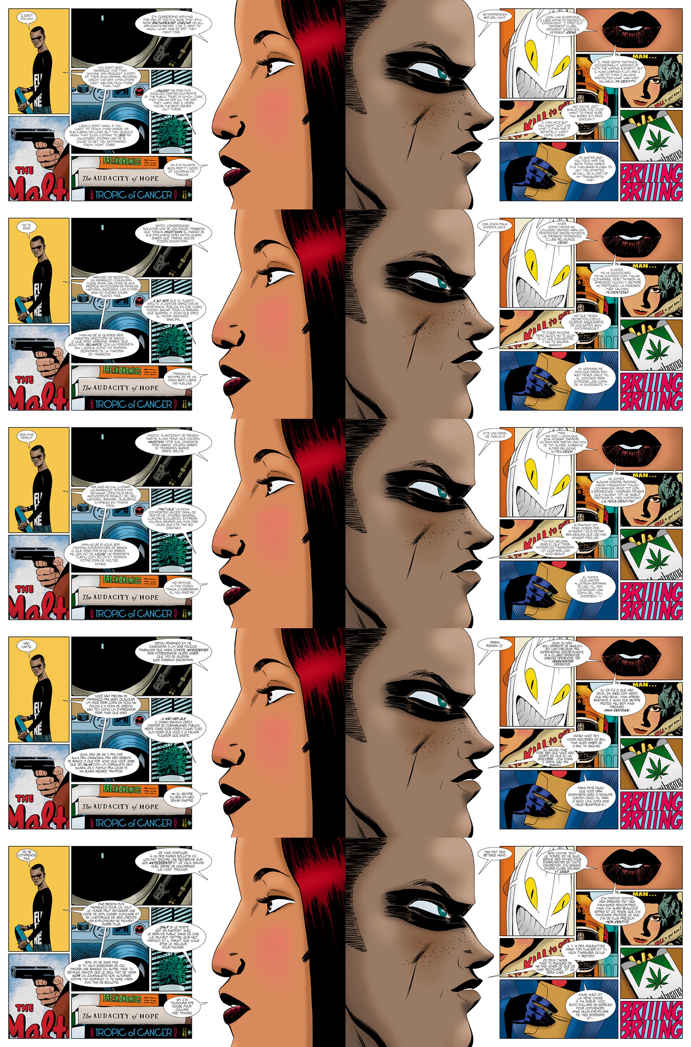
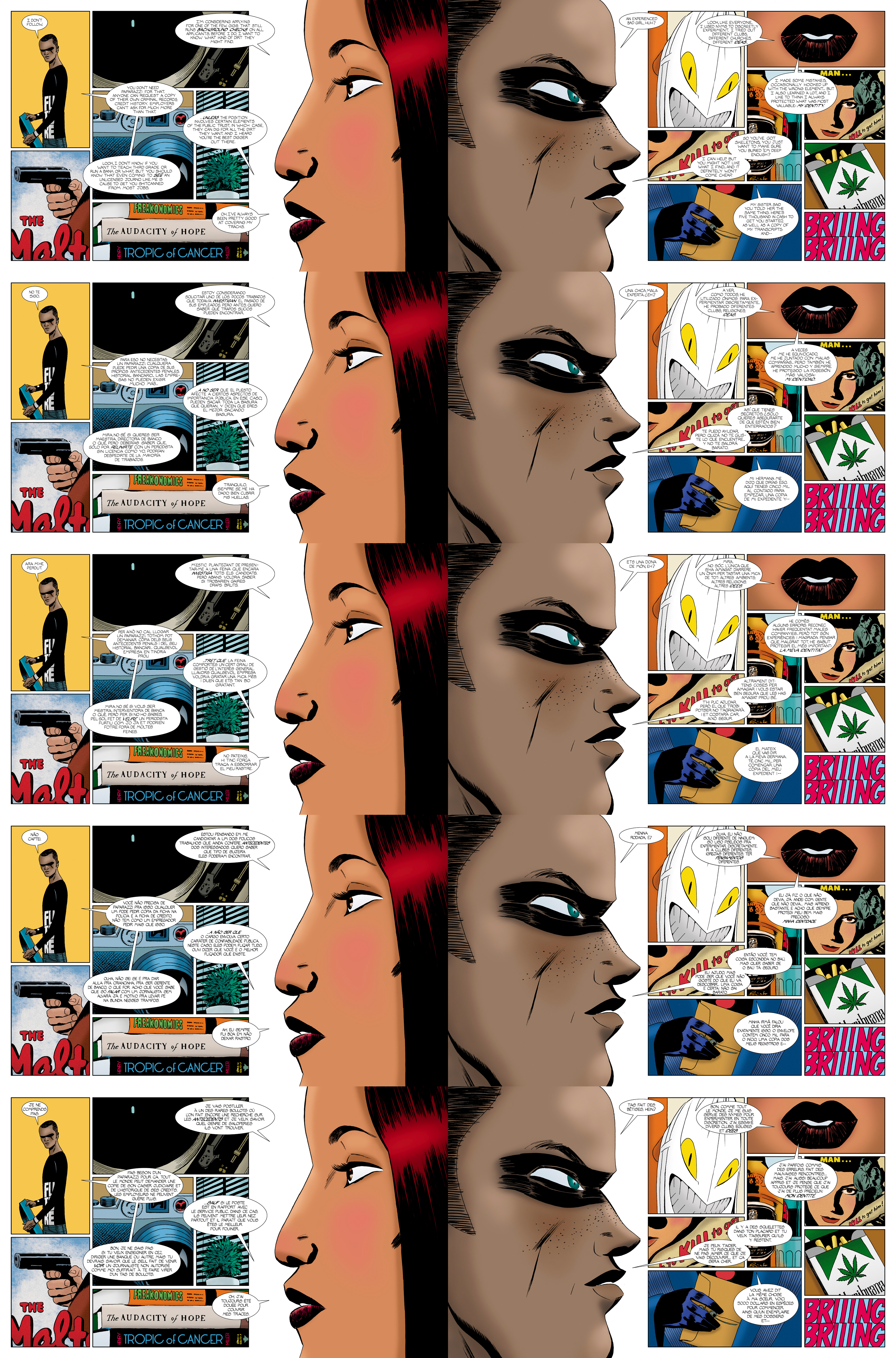
Private Eye #1, Pages 19 & 20, by Brian K. Vaughan & Marcos Martin (Panel Syndicate, 2013)
Languages (top to bottom): English, Spanish, Catalan, Portuguese, French
(Open the image in a new tab or click here for bigger.)
The idea to release The Private Eye online, DRM-Free and Pay-What-You-Want, was Marcos Martin's. He'd been looking to do something like that for some time and the opportunity that presented itself in Brian K. Vaughan's story was too good to pass up (especially in light of the storyline parallels about a specifically analog future without an internet). But Martin's true stroke of genius with The Private Eye's release format is in the multiple languages in which every issue has been and will be released.

Martin is a Spanish artist fluent in Spanish, English and Catalan, a romance language spoken in Southern Spain, France and Andorra. When Martin and Vaughan set up their novel distribution method, it was a small step for Martin to release the material in the three languages he was familiar with. And as each issue was released, additional languages would be added on, to date Portuguese and French with more in the pipeline. The nature of the work's production and release, both purely digital, makes this possible.

In most cases of translations of North American mainstream comics, there is a significant time and logistics lag involved. You first must find a publisher for the work in each market, dealing with the logistics of royalties and copyright. In many cases, even popular works by known creators may not see publication in foreign markets for years after initial North American publication, if at all. The availability in each market may be completely outside the creators' hands, with some publishers licensing out work without contractual obligation to pay royalties or even inform the creators involved. And this works both ways, with many well-received European (especially French and Italian) or Japanese comics never matriculating their way Stateside.

In The Private Eye's case, the work has already been released to every market on the globe with a computer attached, and it is a very simple matter to upload versions released under increasingly diverse languages. There are no printing costs involved and the only limit is the creators' will and the availability of quality translations. By their liberal and aggressive internationalization of The Private Eye coupled with their easy to access DRM-Free PWYW model, not only are Vaughan and Martin able to get access to the vibrant comic markets in North America, Spain, Italy, France and the United Kingdom, but they also have an immediate global reach not limited to countries with a comic tradition, a reach achieved by few creators in the history of comics. In the five languages The Private Eye has been released under so far, they can reach 1.2 billion potential native speakers (not even counting non-native speakers). Naturally the potential audience is much smaller than that, limited by access and desire as is any potential audience, but for the first time Vaughan and Martin have in an instant global audience. And by putting out the translations themselves as soon as possible, they negate the need for "scanlations" (fan translated digital bootlegs) ensuring quality control and added potential financial return.

It is this globalization of the type of quality material originally limited to North America that will change comics forever. The power of the tools Vaughan and Martin have at their disposal, coupled with their vision and will to utilize those tools, are truly remarkable.

Already the industry is shifting in response to Vaughan and Martin's vision: Image has announced that their titles will be DRM-Free, though not Pay-What-You-Want. But some established Image books, as well as every comic and graphic novel put out by America's largest publishers Marvel and DC, are locked into long-term republication and licensing contracts that necessitate large gaps in time and catalog coverage between different languages and regions. But it is a given that more creators with control over their rights to their work - a steadily increasing proportion in the light of the creator-owned renaissance gleefully endemic of this decade - will begin to internationalize their works like Vaughan and Martin have with The Private Eye, especially if they have digital global distribution at their disposal, even DRM limited distribution which most North American comics fall under.  


And of course, the comics medium exists as a unique visual language all its own where there is no translation necessary. But the costs of translation are minimal and the benefits are nearly endless. The Private Eye is the perfect work, with its quality and accessibility, to lead the vanguard of the new future of comics as a truly global phenomenon.

--
The Private Eye by Brian K. Vaughan and Marcos Martin is published monthly, DRM-Free and Pay-What-You-Wish in multiple languages by The Panel Syndicate at www.panelsyndicate.com

Friday, June 28, 2013

The Failure of Fumetti: Force Field Fotocomix

Force Field Fotocomix Vol. 01
Seth Kushner, 2013
Ages ago, or certainly what feels like it, Mark Millar was going around telling people that he was making a meta-superhero photo-comic for Marvel called 1985. Featuring massive sets, ground-breaking CGI, and an extensive live-action cast, the budget was to be in the millions of dollars. Unsurprisingly, this was Millar going off the hype-reservation a bit, something he has quite a habit of doing. Whether or not such a project was ever an editorial reality at Marvel is known only to a few who probably could care less at this point. (1985 would eventually come out with art by Tommy Lee Edwards, illustrated like any other comic.) But if it was a photocomic in the making, did Marvel balk at the ridiculous budget - which is unlikely to have been as much as Millar was saying but still likely higher than your average funnybook - or did whatever preliminary tests that were done simply look too awful to go forward?

Photocomics are better known as fumetti for whatever reasons; odd in part because fumetti is what Italians call their normal, non photo comics. The format largely started out in the late 1970s, not as original comic productions with photographic illustrations, but by chopping up the images from movies and television shows and arranging them into a comic adaptation. Most of these were pretty bad, and the fad was short lived though there are still occasionally such low-rent comics made usually targeted at younger audiences. But published comics featuring original photography in place of art are more infrequent. Ten years ago Vertigo released two graphic novels photographed by Stephen John Phillips to absolutely no acclaim or impact on the market. Since then, outside of the wild west of the internet, there has been almost no instances of original fumetti released to mass audiences in the United States.

The question arises, why the dearth of fumetti? Is it economic considerations in the cost of production? Comics, after all, can be both the realm of the singular auteur as seen in independent comics, or the work of many hands as often seen in mainstream work. But no matter which way you cut it, longer-form narrative photocomics almost always would require many individuals to pull off, an amount of people and subsequent cost putting the work outside the realm of the auteur and into the hands of those with the resources to execute it. At the very least you need a cast, and the visuals begin to fall under the constraints of film or photography and you may also need costumes, makeup, location rights, post-production and so-on. But major publishers aren't exactly known for their willingness to take chances, and producing an expensive work in a largely untested format is largely outside their established purview. Perhaps there are a lack of creators even wanting to make the things... it's not like there is a legacy of photocomics as a touchstone for a generation of creatives. The things are a bit odd, a novelty in the best of situations, and those who are most likely to make comics are most likely to be culturally or aesthetically influenced by other comics, which are done in hundreds of different styles, all drawn or painted or designed in some fashion rarely involving the direct use of photographs. 

Or maybe the medium of photographs in place of illustrations in comics just plain doesn't work.

From "Hall of Just Us"
Into the photocomic void steps Seth Kushner, with Force Field Fotocomix Vol. 01. Collecting a couple of pieces published elsewhere as well as new material, Force Field Fotocomix was self-published this spring by Kushner and was produced with cartoonist and Act-I-Vate mastermind Dean Haspiel. Aiming to revitalize if not outright recreate the whole medium, it succeeds only at illustrating the aesthetic limitations of that medium, and possibly the storytelling limitations of the creator.

Seth Kushner is an accomplished photographer who's work has appeared all over the place in print for nearly twenty years, and he's really quite good. After releasing his amazing book of photographs of cartoonists, Leaping Tall Buildings, he began working on CulturePop Photocomix, a work that combined photos of his subjects with material from his interviews with them into a kind of series of semi-narrative photo-essays, work he contends is "wholly unique." Maybe I'm being reductive, but these projects really just seem like captioned photograph sets. In any event, Kushner wanted to expand beyond non-fiction studies into a "full fictionalized graphic novel told through a dramatized photocomic," the attempts at which can be found in Force Field Fotocomix.

And as a package, Force Field Fotocomix is a bit of a mess. After a two short fumetti stories, there is a lengthy photo-essay fumetti thing by Kushner about his career and thought process leading up to the volume, followed by two more short pieces. The first story, "Hall of Just Us" by Kushner and Haspiel features various costumed types at a tarot card reader, who argue over the affections of said reader only to be shown up by a shirtless luchador (played by Haspiel). It's not very funny, though I think it's supposed to be. The second story, "Spiders Everywhere!!" is a dialogue-free comedy-horror pastiche by Kushner and Chris Miskiewicz where a woman wakes up to, well, spiders everywhere, and everyone freaking out to spiders everywhere. Fake plastic spiders everywhere. Both stories just seem like unpolished short films made on VHS by friends goofing around at home, things that simply do not appeal beyond those personally familiar with the cast and crew. I'd say these were a waste of time but it only took a minute ("a" as in quantifiably "one") to read. 

The lack of professional polish or narrative quality in the two opening pieces is a turn-off, and doesn't even get into the weaknesses of fumetti, though those weaknesses are very much on display. The overacting of the subjects in "Hall of Just Us" and the cheapness of the props in "Spiders Everywhere" are immediately evident. Also noticeable, and I think this is one of fumetti's biggest problems, is the lettering. Lettering is an art all its own, and the lettering in "Hall of Just Us" is quite bad. Bad font first, but more importantly is the jarring way that the lettering and balloons interact with the visuals. There is simply no naturalistic way to get word balloons to mesh with photographs in the same way that it can with illustrations. The way lettering and balloons work are as illustrations of language, and the illustrations of the balloons never, in any instance I have ever seen anywhere, combine well with the reality of the photographs. 

One of the more illustrative pieces, from "The Perfect Woman"
The final story, "The Perfect Woman," largely avoids the lettering trap by using almost nothing but captions, and visually works better... until the last two pages which get jarred by the lettering and you again realize that the story wasn't all that good. Kushner is an accomplished photographer by any account, but his bona fides as a narrative storyteller are startlingly absent in all these stories. The third story - "The Complex" - is introduced by Kushner himself as "an allegorical drama about four lost souls orbiting each others lives and making a connection that matters before the end of the world." I frankly have no idea what the fuck he's talking about. I assume what we are presented here of "The Complex" is just a small part of a larger graphic novel because it abruptly ends and "The Perfect Woman" starts up. What we get is an obtuse science fiction story of some sort. Hell, maybe "The Perfect Woman" is part of "The Complex," it very well could be, it's frankly hard to tell. No matter what, though, Kushner's weakness as a storyteller is again evident.

One might see the weaknesses of the stories having a deleterious effect on my view of fumetti as a medium, but, honestly, fumetti is too weak on its own to work. There's something unnatural about the nature of photographs in a narrative medium. Perhaps fumetti represents a unique corollary to the Uncanny Valley. When you move farther away from representation into literalism, it takes you out of the work. Fumetti, to me, just looks like actors posing with or without photoshop effects and those damned jarring word balloons. 

From A Softer World
There are some photocomics that work, but they don't use word balloons and are largely extra-narrative. The captioned parts of "The Perfect Woman" are one example, a better example is the elegiac, almost undefinable non-narrative photo-poem webcomic strips of A Softer World by Joey Comeau and Emily Horne. A Softer World continues to astonish me: it can be funny, sad, beautiful, poetic, often all of that and more. But A Softer World is as far from fumetti as you can get. It isn't a narrative photocomic, but a poem in words and pictures that transcends what even some traditional comics are capable of.


Art, L to R, by Hickman, Maleev, and Harris
It is very important to point out the obvious and important role photography as a reference tool is in  comic illustration. Many, many artists use photoreference in their work as jumping on points, to nail down the physiology of a movement or capture the visual of a setting. But in every case of photoreference, the finished product is still a representative illustration. Artists like Alex Maleev, Tony Harris, and Jonathan Hickman heavily rely on photoreference for the production of their visuals, which are photorealistic in many ways. Despite how much they rely on photos in their finished product, the end result is illustrative enough that the Fumetti Uncanny Valley simply vanishes, and often the settings and actions and framing breaks far, far away from what can be reasonably captured in photographs.


Kushner, by Kushner.
Kushner cannot be faulted for trying, of course, and I believe he and his co-contributors worked their asses off and were quite serious in their intention of reigniting the photocomic medium. Kushner himself notes that "Complex" is an ambitious idea and that "every other attempt to make projects like this felt like a failure" to him. But despite his obvious skill as a photographer and his love of the comics medium, the efforts presented in Force Field Fotocomix are a failure as well, a failure inherent in his chosen medium as much in the execution of the pieces on display.

--
Seth Kushner's Force Field Fotocomix Vol. 01 is in stores now. 

For more on A Softer World, check out my review here.

Thursday, May 23, 2013

A Lungful of Melancholy: Justin Madson's Breathers

Breathers by Justin Madson
Just Mad Books, 2011
Breathers is a 2011 graphic novel written, illustrated and published by Justin Madson, collecting his mini-comic serialized between 2007 and 2011. Two things immediately jump out: Madson's illustration style and the size of the graphic novel. Both a strength and a weakness, Madson's art style, as far as human characters go, is fairly unique: in stark black-and-white art, the characters have gangly appendages, long faces above the mouth, and Harold Gray-Orphan Annie Eyes. It's not as extreme as another recent graphic novel inhabiting the language of sadness, Chris Wright's Black Lung, which almost borders abstraction, but it does make facial identification difficult in places. His draftsmanship is competent enough that the novel holds together visually, though, and despite the length - 425 pages - it is a fairly breezy read.

Breezy in terms of time, though certainly not in tone. Despite it's high concept and aims, the most striking feature upon reading it is the pervasive melancholy that is infused into every character, every interaction, every fiber of the book itself. Forty years ago, a virus is loosed upon the Earth in the very air we breathe, so all humans are required to wear special "breathers," apparatus that allows people to go outside. There is a fear of the air which is quite deadly, though some think the virus may be dissipating and the whole breather thing is a giant conspiracy theory. The sadness felt by the characters isn't because of the virus, though. They are all just really, really sad.

Ostensibly this is a character piece about a bunch of unrelated people in a smallish town and the tangential ways some of their lives interact. The novel is divided into chapters with each chapter featuring a shorter sequence focusing on one character or group of characters. Some of the story arcs intersect and some don't. It's hard to juggle characters in a shared setting like this in an interesting enough way without getting gimmicky, and the characters need to be compelling enough on their own. Unfortunately they aren't. There are a few interesting things done with the concept, but there is largely nothing done in Breathers that can't be done without the sci-fi hook. That wouldn't be a bad thing if the characters' various arcs were interesting, except, again, that they really aren't. There are decidedly supernatural elements sprinkled throughout that just don't quite fit, and there is some attempt made at overexplaining things as far as the virus is concerned.

Overall it doesn't quite work, but even through it's narrative messiness, Madson's art style is interesting enough to stick with it. You can do worse for thirty bucks, and if you don't want to get the hard copy you can download it for five dollars direct from the author. If read in small chunks, the lack of cohesion and silliness - and the ceaseless gloominess, which might just be the real virus of the story - will be a lot more bearable.

Breathers is available for purchase or download on the author's website here, as well as from finer comic shops just like JHU Comic Books in New York City.

Monday, April 22, 2013

Advance Review: Silence & Co. by Benshemesh & Randall, Out May 29

Silence & Co
By Gur Benshemesh & Ron Randall
Crystal Productions, 2013
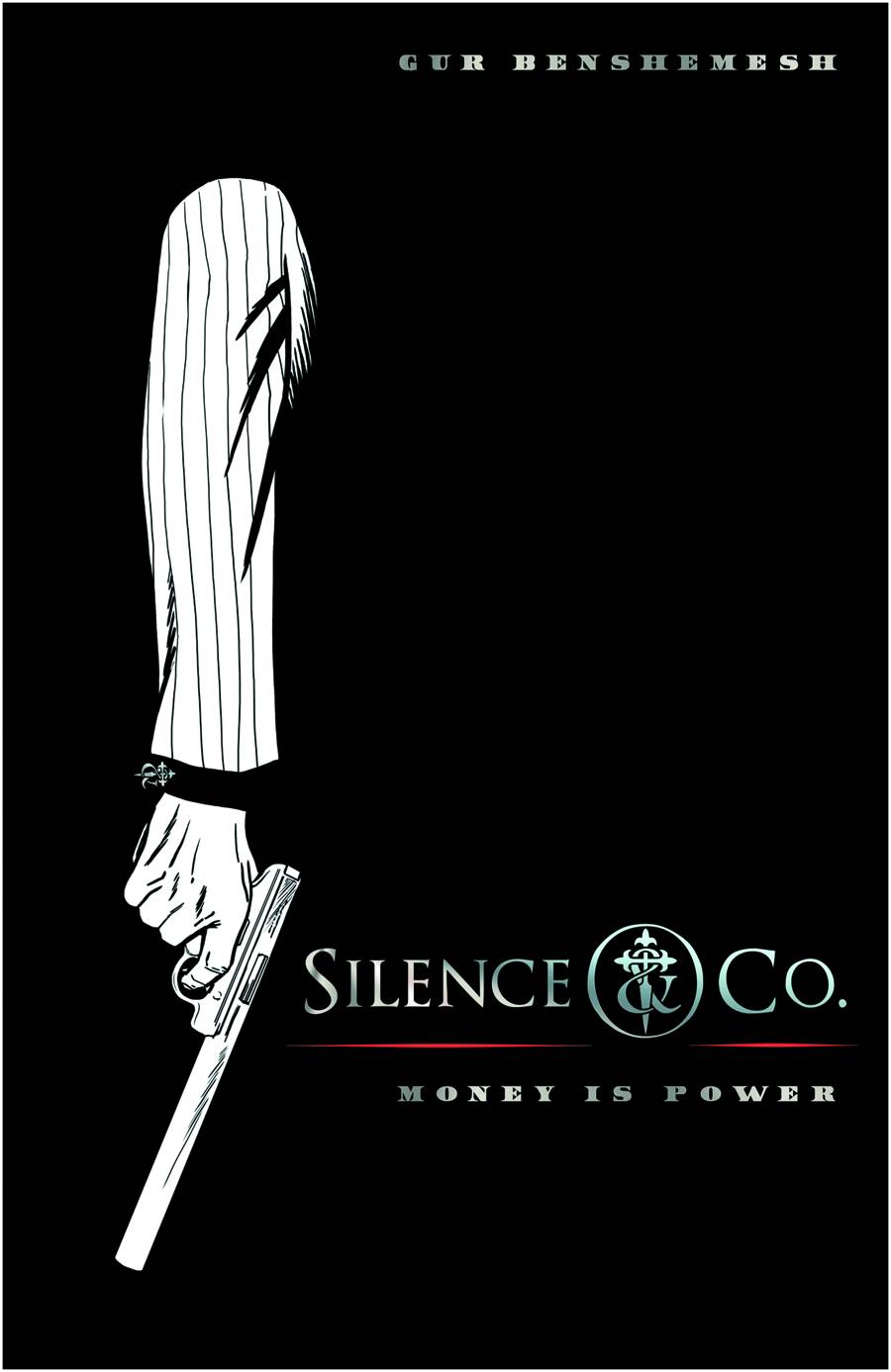
Silence & Co. is a new original graphic novel written (and, it seems, published) by newcomer Gur Benshemesh and illustrated by Ron Randall, coming out at the end of May. The story opens with Alexander Maranzano, a hit-man for a legendary New York Crime family rolling up on a federal judge in the dead of winter and putting a bullet in his head; the judge was prosecuting his father for something crime bossy. Alexander was raised by his uncle because he was the illegitimate son of his father and a Puerto Rican woman - as such he was largely disowned by his family but still does hits for them. A one time special forces military type, he heads to Marakesh to lay low from the heat. While chilling at the pool, he's approached by some cokehead assassin to run a quick job out there. After deftly handling it despite the myriad problems, the (now dead) cokehead's employers - some mysterious organization called Silence & Co. - hire Alexander for an elaborate hit on a Colombian drug lord, for the unreal sum of ten million dollars. This all happens fairly quickly, and it was at this point that the story devolves into a complete mess.

Now to be clear, the story is cohesive, the stakes clear, the action straightforward. But it strains, if not outright breaks, the suspension of disbelief. Silence & Co. hire Alexander, who is a family hitman and not a free agent, but whatever, and offer to pay him the completely unbelievable sum to coordinate the hit on the drug-lord, when it becomes obvious that Silence & Co. are more than capable of handling the operation themselves. The operation itself is this insane over-the-top military assault featuring attack helicopters and dozens of paramilitaries. The story, which started out as a promising noir about a disillusioned hitman becomes this ridiculous and completely unnecessary wargasm. And then naturally there are double crosses and a pretty girl Alexander refuses to kill. See, the pretty girl is the mistress/accountant of the crime boss, so that somehow makes her a civilian, and Alexander doesn't kill civilians, although he does kill lots and lots of worker bees in the crime organization, but she's a pretty girl so she gets a pass. Oh! And also, not only was Alexander a military special forces officer but he was ALSO some kind of secret super-hacker for the government and at one point he creates some kind of superworm that infiltrates and wipes out the computers of some crime organization that's been around for centuries. And despite being a known assassin he's given control of an Internal Affairs sting on an FBI senior agent. And then there's more double crosses. And then, and then, and then. And then. Sometimes too much is too much.

Ron Randall's black-and-white art is decent, though there is one silly splash page that seems like something swiped from a Kirby Sgt. Fury issue. His stuff is stronger in the straightforward noir scenes but can't quite live up to the inanity/insanity of the war-stuff. Randall doesn't receive any kind of cover credit which is frankly unacceptable. I guess Benshemesh - who has not previously written anything and is also credited here as "producer" - paid for everything and is publishing it himself, but that doesn't make you the sole author, dude. There are also odd bits about the final product, like the needless use of quotes within the narration captions and the use of asterisks with explanatory captions noting that the characters are speaking Spanish in every single word balloon that characters speak Spanish. Amateur foolishness like that almost seems like a parody (not to mention easily caught production mistakes like comas where apostrophes should be).

Silence & Co. is a self-published vanity graphic novel from a writer who is not frankly ready for prime-time. Maybe if he held back and did a New York crime story instead of throwing all that spaghetti at the wall it would have been a stronger work. In the first few pages I honestly thought the comic would be a nice follow up to fill the void left by the superb hitman graphic novels from Europe, The Killer. But in the end I was just left thirsting for more of the subtle, psychological international thrillers in Matz & Luc Jacamon's killer Killer to clear the bad taste left by this repeatedly sharkjumping mess.

Silence & Co. will be released to comic shops on May 29. For more visit http://www.silenceandco.com

Thursday, February 21, 2013

On Deconstruction and Sidekicks

The following article was originally published on JHU Online in December 2008.

The concept of the sidekick has always perplexed me, and to be honest, I cannot recall ever enjoying a comic that featured them in any prominence. Maybe because I've always been a "Marvel Guy" and the only notable sidekicks were Bucky and Toro in the 1940s and 1950s, or maybe because, even in worlds with gods, monsters, and flying men in spandex, it always seemed a stretch that one would bring a child along to wage battle against criminals and psychopaths. What kind of person plays dress up and cops and robbers with underage boys and girls? This isn't Fredric Wertham territory, here, these are questions of basic logic - questions Rick Veitch's Bratpack attempts to address, after a fashion. 

The story opens is fictional Slumberg, PA, a particularly bleak city that is wallowing in filth and crime in the aftermath of disappearance of the Superman-like "maximortal" True-Man. A group of four superheroes has attempted to fill the void, employing sidekicks along the way. We are introduced to the young sidekicks - jaded, loathsome - only to see them murdered by Dr. Blasphemy, a supervillain of sorts. The story then follows the recruiting and training of a new group of sidekicks, and things get predictably twisted.

I say "predictably" because I am reading this in 2008, at a time when the superhero has been deconstructed multiple times, and one has become accustomed to the exploration of the seedy underbelly of the superhero concept; in 1991, when the book was originally released, this likely would have been - and is still seen by some - as a seismic shift in the theory and practice of the superhero story (Heidi MacDonald groups it with Watchmen and Dark Knight Returns as a "troika of immortal works dissecting the superhero genre"), and one can easily see the possible influence on many current works such as Garth Ennis's The Boys. That is not to say that there are any real revelations here, that there is any subtlety to the deconstruction... whereas Watchmen's deconstruction was elegant, literary, and in my opinion incidental to the story being told, Bratpack's is as subtle as a jackhammer. Veitch does go into that Wertham territory head first, even dedicating the book to the good doctor. The book quite clearly spells out its intentions (superhero = twisted fascist) and its metacommentary on several long-standing comic book tropes is clever and yet a bit over-emphasized. The superheroes are ugly shells of people, twisted caricatures of several easily recognizable archetypes, and the new sidekicks' collective journey from wide-eyed innocents to abused abusers is nothing new. Despite this and other minor faults (the first half of the book drags a little), the payoff in tone and message is well worth the trip. Veitch even manages to sneak in some nice philosophical surprises along the way, especially as it applies to the void left by True-Man's absence with an anti-Superman argument as succinct as any I have seen.

I would be remiss if I did not mention Veitch's art. At first glance, the black-and-white art is unremarkable. But as I read the story, the page layouts and panel design really began to pop out. The style of the art is appropriately reflective of the tone of the story, and there are several points in the book where Veitch lingers on random scenes from around Slumburg that more vividly paints a picture of the time and place of this story than pages of clunky exposition (which this story does suffer from early on). As the story becomes fractured, splitting between the four heroes and their sidekicks, the art keeps up in clever pacing and layouts, revealing a mastery of craft that may be missed on first pass. - This is not a perfect book, but it is a fun, provocative read, and on continued reflection, certainly begs consideration as a book that belongs on a must-read list for anyone looking for an examination on the meaning and purpose of the costumed vigilante... and their sidekicks.

c) 2008, 2013 Jeffrey O. Gustafson